CASE STUDY

%20copy%202.png?width=1500&name=Influencer%20Circle%20Headshots%20(2)%20copy%202.png)
About
Kevin Silverman is CIO and Portfolio Manager at Sterling Partners Equity Advisors. He is responsible for selecting securities and managing portfolio strategies to ensure they are consistent with his client’s objectives and risk profiles. While he generally targets small-cap value securities, Kevin’s ultimate goal is to seek out the absolute best returns for his customers. He earned his BBA and MS in Finance from the University of Wisconsin-Madison. Kevin is also a CFA charter holder and committee member at the CFA Society of Chicago. He has over 30 years of experience in the financial services industry growth and some short-term profits from trading.
![]()
I was looking for a robust investment research platform that offered efficient, comprehensive datasets that would allow me to find the information I needed without compromising on speed or data quality. But at the same time, I also didn’t want to pay for Bloomberg or FactSet either.
![]()
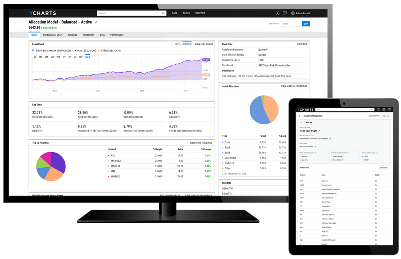
When I started using YCharts, one of the first things I noticed was its flow and how intuitive it was to navigate. Finding information was easy, and I didn’t need a manual or any significant guidance beforehand like I would for a Bloomberg Terminal or FactSet.
![]()
Before YCharts, I had to make all of my own presentation materials, charts, and reports. Because the platform allows me to spend less time ‘in the past’, I can spend more time thinking about the future. I’ve been able to re-invest that newfound time into maintaining client relationships, marketing efforts, investment research, and growing the practice.


Success Made With YCharts
As Sterling Partners Equity Advisors’ CIO and Portfolio Manager, Kevin Silverman leverages YCharts to identify securities of interest, perform comprehensive research and analysis, and streamline the creation of client reports and presentations.